LA Times redesign
13Aug09
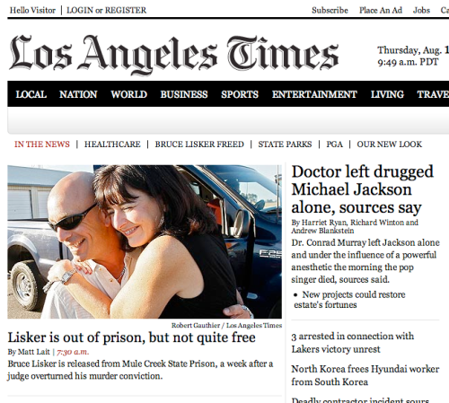
L.A. Times rebooted this week. Interesting redesign:
Less clutter, with a more retro, monochromatic look. Reminds me of the front page of the L.A. Times when I was a kid. Very Atlantic, CAP-style nav… tidy little sections with top features and headlines. Not sure if I like the expanding/contracting boxes below the fold on the left, but an interesting approach.
All-in-all, it seems much better than the old site design. If they erred, they erred on the site of showing less, rather than more and simplifying the home page rather than trying to pack it with new features.
Filed under: Design, Trends | 1 Comment

It’s very monochrome, though (much like NPR’s). In particular, all of the links are the same color as the text, which is generally bad form.
I also feel like it doesn’t really direct the eye well; even their feature story doesn’t stand out too much. (This is partly because it doesn’t use color, but NPR used varied font weight, heavier lines, and more whitespace to better address that problem.)
Top headlines in place of sub-navigation is an interesting idea. Their footer is excellent.